I'm prepping for my undergraduate growth course this semester (which uses an AWESOME book, by the way). We don't require calc from our econ majors at UH, so I have to ease them into a few things during the course. One of those is using logs to both visualize and then analyze economic growth. This post is some notes I started working on to help introduce students to the concepts.
If you're teaching, this might come in handy. If you're interested in growth, but a little shy about math, this might be helpful. If you literally have nothing better to do, it will kill about 10 minutes and/or help put you to sleep.
We're interested in living standards, as measured by real GDP per capita. We don't concern ourselves a lot with the absolute value of real GDP per capita, as that number depends on exactly how we construct price indices, base years, etc.. What we care about is how fast economies grow. This is like saying that we don't care whether you start at 150 pounds or 68 kilograms; but if your weight grows by 5% per year we know you are going to get fat.
To visualize those growth rates, and to do some crude analysis, we invariably plot real GDP per capita in logs. When I say log, I mean the natural log. There are lots of cool explanations of how natural logs work, but this post is not one of them. For now we're going to take it on faith that natural logs work the way I say they do.
Take the natural log of GDP per capita in each year, and graph it against the year itself. The figure below, for India, is an example, where real GDP per capita is plotted using the grey line.
Natural logs have a few great properties for our purposes. Using them means that every step up the y-axis is an identical percent change in real GDP per capita. Going from 7.0 to 7.5, for example, is a 65% increase in real GDP per capita. Going from 7.5 to 8.0 is also a 65% increase in real GDP per capita. This is true even though from 7.0 to 7.5 is going from $1,096 to $1,800 in GDP per capita and going from 7.5 to 8.0 is going from $1,800 to $2,980. By plotting things in natural logs we can see the percent increases, rather than the absolute increases.
Even more fun is that because of this property, we can pick off the average growth rate between two years relatively easily. The average growth rate between two years is just the slope of the straight line connecting the two end points. In the figure for India, I've overlaid the calculation of the growth rate for several sub-periods, as well as the average growth rate from 1950 to 2010.
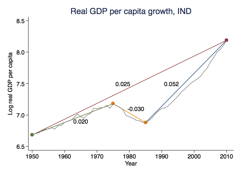
From 1950 to 2010, as an example, connect the two end points, and find the slope of the line. You could do this mathematically as follows
$$ g_{1950,2010} = \frac{ln(3596)-ln(798)}{2010 - 1950} = \frac{8.19 - 6.68}{60} = 0.025. $$
For the other sub-periods, you do the same thing, just using the end points from those time periods. So from 1950 to 1975, growth average 2.0%, from 1975 to 1985 if average -3.0%, and from 1985 to 2010 it averaged 5.2%.
Why those particular sub-periods, and not others? Solely because they looked like obvious break points. There is no formula for deciding what sub-periods to calculate. It just seems intuitive that ``something different'' happened around 1985, for example, that sets that period apart from the others. But you could calculate the growth rate from 1972 to 2003 if you wanted to. You want to argue with me that the 1985 to 2010 period should be broken up again into pre-2003 and post-2003 sub-periods? Okay. I can't tell you you're wrong.
The three sub-periods I did calculate have the feature that their average growth seems very close to the actual growth. That is, the actual path of GDP per capita doesn't stray very far from the straight line we used to calculate the average growth from 1950 to 1975, for example. What do I mean by ``very far''? Nothing technical, just eye-balling it.
Compare those three sub-periods, though, to the whole stretch from 1950 to 2010. We calculate average growth at 2.5%, but the straight line that gives us that answer lies well above the actual real GDP per capita for almost the entire period. Average growth from 1950 to 2010 doesn't give us a very accurate picture of what the growth experience of India was like in history, where there really appear to be three separate periods.
That doesn't mean 2.5% is wrong. It is exactly the average growth rate from 1950 to 2010. If you started at real GDP per capita of $798 in 1950, and applied 2.5% growth to that, you'd end up with
$$ y_{2010} = 798 \times (1 + 0.025)^{60} = 3,511 $$
which is just rounding error away from the actual value of $3,596. But the path from 1950 to 2010 looks a lot different at 2.5% average growth every year, compared to the actual path real GDP per capita followed in India in this time span.
Regardless, we'll be interested at times in precisely those periods when the average growth rate is very close to the actual growth rate of real GDP per capita (the straight line is close to the gray line). 1950 to 1975, as we said, or arguably 1985 to 2010. These periods could represent what we'll call ``balanced growth paths'', or BGP's.
We're interested in BGP's because our theories of growth are going to suggest that, in the absence of any fundamental change, a country will tend to end up on a BGP. That is, without any major shock to a fundamental characteristic of the economy, an economy will tend to have actual growth close to average growth. Further, if we see different BGP's, then this indicates that something fundamental did change.
What the picture from India says is that the period from 1950 to 2010 was not a BGP for India. 1950 to 1975 could be one, and then in 1975 something fundamental was just different. What something was it? We cannot tell from this figure. We'd have to dig into other data on India to decide, and our theory might tell us likely candidates to explore. In 1985 something again appears to have fundamentally changed, as again India switched to what looks like a new BGP. And again we'd have to explore other data to decide what changed.
Just to be complete, what we see in the figure is necessary, but not sufficient, to establish that India was on a BGP. That is, there are other conditions that are also necessary to classify a period of time as being ``on a BGP'', and there may be other reasons that India was not on a BGP from 1975 to 1985, for example, even though actual growth was close to average growth. But as a start, looking at a figure like this tells us where we should start looking.
To be even more complete, just because most of our theories suggest countries will end up on a BGP in the absence of a major shock doesn't mean they are right. Our theories could be completely wrong. Maybe nothing fundamental changed in either 1975 or 1985, and all that happened was that India got really unlucky for a few years. Perhaps we are making too much of these extended runs of similar growth rates.