From 1990 to 2015, the US economy as a whole increased employment by about 30 million (30,056,664 according to the BLS). Employment in 1990 was 118,900,000, so that meant that there was a roughly 25% increase in employment over that 25 year period, with a little more than 1 million jobs added per year, on average.
I’m not going to surprise anyone by saying that these 30 million jobs were not spread equally across the entire US. What I didn’t have a good sense of, personally, was how disparate the change in employment was across the US. This post is just some documentation about the absolute size of the change in job distribution across the US. I don’t know that I have a broader point, but I don’t really internalize the information until I play with it, so this is me trying to internalize the information on shifts in jobs within the US over time.
The BLS provides county-level employment totals for 1990-2015, hence the time frame I’m looking at. And I can calculate the change in total employment in that 25 year period for each county. I could use the size of the labor force instead (employed plus unemployed) but the patterns I’m going to show you here don’t change appreciably.

First, of the 3,133 counties for which I have data, 909 of them lost jobs in absolute terms from 1990 to 2015. The map highlights those 909 counties in pink. The location of these counties are not terribly surprising, although I don’t think I realized how much upstate New York’s employment numbers had dropped over time. You can see the smudge of pink in coal country of West Virginia and Kentucky, along with a big set of job-losing counties in the deep, deep south of Mississippi, northern Louisiana, and southern Arkansas. Downstate Illinois and a swath across the Great Plains also saw absolute declines in the number of employees over 25 years. In total, those counties saw employment fall by 1,471,436 jobs in this period, from a base of about 19.5 million jobs to just over 18 million jobs.
Beyond the 909 counties that lost jobs in absolute terms, a number of counties lost jobs in relative terms. What I mean by relative loss is as follows. Total employment in the US grew by 25% from 1990 to 2015. If the distribution of jobs across counties stayed fixed at the 1990 distribution, then all counties should have seen job growth of 25% as well. A county that had job growth below 25% then saw a relative decline in employment compared to the rest of the country, and one with job growth above 25% saw a relative increase in emploment.
There were 2,188 counties that saw a relative decline in employment over this period, or roughly two-thirds of the counties in the US, and includes the 909 counties with absolute losses. Those counties started with roughly 73 million jobs, and finished with 78.4 million in 2015, an increase of about 5.4 million jobs, or about 7.4%. If those counties had instead grown at 25%, like the US as a whole, they would have had about 91 million jobs, an increase of 18 million jobs.
These 2,188 counties fell about 13 million jobs “short” of what we’d expect given the 1990 distribution of jobs. Which means that jobs moved out of those 2,188 counties, and moved into the other 944 counties that gained in relative terms.
Those 944 counties started with 45.5 million jobs in 1990, and ended in 2015 with 70.5 million jobs, for a gain of about 25 million jobs, which is a percent gain of 55%. The 944 counties that gained in relative terms over this period gained 13 million more jobs than we would expect.
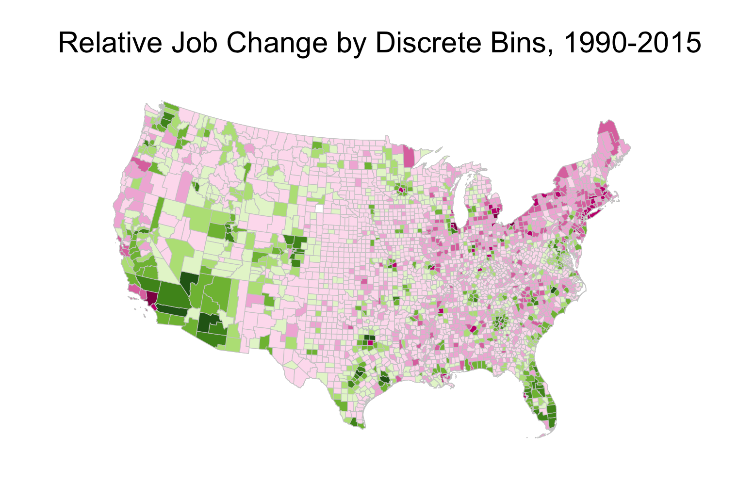
The map here plots the relative job change, in number of jobs, for each county in the US over this period. I didn’t include the legend because it got too busy, and shrinking it down made it unreadable. The darker green the county, the more jobs, in relative terms, that it gained over this period. The darker the pink/red the county, the more jobs, in relative terms, that it lost over this period.
Harris county (Houston), where I live, is a dark green smudge down on the Gulf Coast of Texas. It gained 663,757 jobs over 1990-2015. That is 291,540 more jobs than you would have guessed based on the 1990 distribution of employment, the relative job change. Other counties with big relative gains include Maricopa County, AZ (Phoenix) with 566,974 extra jobs, Clark County, NV (Vegas) with 477,942 extra jobs, and Riverside County, CA (greater LA) with 341,434 extra jobs. You’ll also see dark green counties in North Carolina (Charlotte and Raleigh), Texas (Dallas, San Antonia, Austin), Colorado (Denver), and Florida (basically everything but the panhandle).
The biggest relative losers in job terms are generally older cities. LA County came in 628,796 jobs under what you would have thought - it gained only 441,710 jobs but we would have guessed it should have gained over 1 million based on the distribution in 1990. Cook County, IL (Chicago) lost 558,190 jobs in relative terms. Wayne County, MI (Detroit) lost 378,043 jobs in relative terms. Cuyahoga County, OH (Cleveland) lost 225,300 in relative terms. Other big relative losses happened in Philadelphia, Milwaukee, Pittsburgh, St. Louis, Baltimore, Hartford, and big swaths of upstate New York (Buffalo and Rochester, mainly).
These big losses are dominated by big cities because they start with big populations. We can look instead at scaled relative change of jobs. That is, take the relative change in jobs (e.g. -225,300 relative jobs lost in Cuyahoga County) and divide by the initial level of jobs in that county in 1990 (e.g. 642,367 in Cuyahoga County) for a scaled loss (e.g. -0.35 for Cuyahoga).
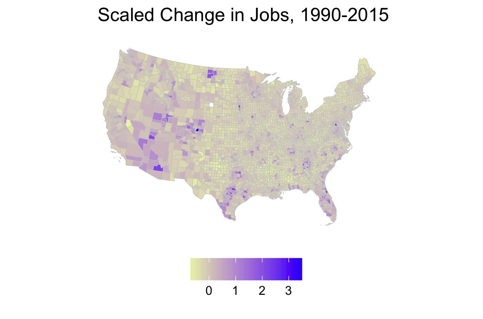
The map shows these scaled changes, and the message is similar to before. It was relative loss in the Upper Midwest, Northeast, and some core parts of the South and relative gains in very concentrated urban areas that generally lie in the Sunbelt, plus Denver. So it is not only
Again, I’m not claiming that this is some kind of revelation here. The movement of population, and hence jobs, from the Northeast/Midwest to the Sunbelt is well known. What I found interesting was putting some tangible numbers of the shift. The little counter-factual I’m doing here is not very rigorous; there is no particular reason to believe that the 1990 distribution is the “right” distribution of jobs to compare against. But the 1990 distribution does have the feature of being prior to NAFTA and prior to China’s accession to the WTO, both of which are at times cited as sources of manufacturing job losses in the upper Midwest and Northeast.
The scale of the relative job changes, though, indicates that more of the losses have to do with free trade within the US than free trade outside of the US. The areas with relative decline lost 13 million jobs compared to the 1990 distribution of jobs. In total the US shed 6 million manufacturing jobs from 1990 to 2015 (18 million to 12 million, roughly). So this relative decline cannot possibly be a function only of manufacturing and international trade in manufactured goods. There is just too much relative movement out of the declining counties to attribute to this. This is a sloppy way of thinking about how this would work counter-factually (I’m ignoring spillovers entirely), but if you magically added 6 million extra jobs to those counties in relative decline, they would still be in relative decline compared to the Sunbelt in terms of jobs. They’d have 84.4 million jobs (as opposed to 78.4 million), but you’d expect them to have 95.6 million based on the 1990 distribution, so they would still be 11.2 million jobs off the pace.
The breadth of relative loss, though, seems striking, and is the one thing I did not appreciate prior to looking at this data. 909 counties lost jobs in absolute terms, which is 29% of all counties. Another 1,279 counties, 41% of all counties, gained jobs in absolute terms buy lost in relative terms. 944 counties, 30%, gained in relative terms. Just as many counties gained in relative terms as lost in absolute terms. The winning locations - Houston, Dallas, Atlanta, Miami, Phoenix, Denver, Vegas - won big, but the losing was spread across a wide area.
More jobs in 2015 are still located in places in relative decline (78.4 million) than are in places in relative ascent (70.5 million). Of those 78.4 million, 18 million (or about 12% of jobs) are in counties that experienced absolute job losses over the last 25 years. Most jobs are still in places that look to be losing out to Sunbelt cities over time. To the extent that your local economy plays a role in forming your opinions, this seems relevant, although I am going to stop now before I try to do any amateur political science or sociology.