A few weeks ago I posted about the recent decline in capital per worker in the U.S. The short summary is that from 2009-2013 capital per worker has been shrinking, and this is at odds with most of historical experience. This shrinking capital per worker contributes to higher measured productivity growth.
The illustrious Areendam Chanda asked, in response, what the marginal product of capital looked like given the decline in capital per worker in this series. This is straightforward to calculate given the BLS data, and it shows what I think is an interesting pattern.
First, I calculate the MPK as
$$MPK = \alpha \frac{Y}{K} $$
where ${\alpha}$ is capital's share of output. If the world is roughly Cobb-Douglas, this should describe for us the extra amount of output we could get from one additional unit of capital. This is an aggregate concept, and doesn't necessarily map to any specific use of capital (e.g. the marginal product of a laptop can be different than the marginal product of a shovel). This is the marginal product of dumping an extra unit of homogenous ``capital'' into the economy.
Here's the figure showing the time path from 1960 to 2013:
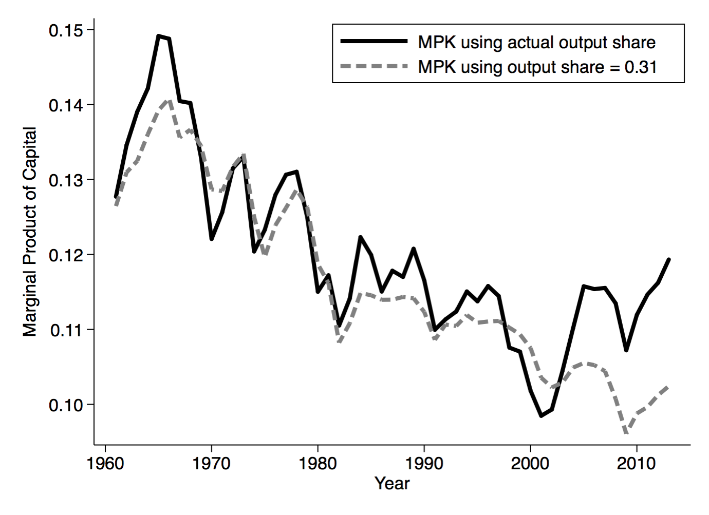
In terms of the recent decline in capital per worker, the uptick in the actual series (black line) from 2000-2013 makes some sense. Declining capital per worker should be associated with a higher return on capital. But what appears to be true is that the recent uptick in MPK is driven by a change in capital's share in output. I plotted in gray an alternative MPK that assumes capital's share is constant at 0.31 (a rough long-run average), and as you can see this continues the downward trend of the prior decades. The uptick is due almost entirely to the increase in capital's share of output.
What seems far more interesting in this figure is the general drift downward in the MPK since 1960. I can come up with two different interpretations of this, which depend a lot on the time frame you consider.
Secular shift in MPK: Essentially, interpret this as evidence of some kind of sustained, secular change in the US economy. The drift down in the MPK isn't consistent with the US being on a balanced growth path (BGP). As a quick reminder, traditionally a BGP is a situation where GDP per worker is growing at a roughly constant rate, the return on capital (MPK) is constant over time, and the share of output going to capital is constant over time.
And we almost always presume that the US is on a BGP. I will be telling my undergrads this in a week or so, I'm sure. Almost every growth model is written so that it delivers a BGP eventually, because people feel that this represents what we see in the data. And when they say ``BGP'' in their model, they almost always mean that the MPK is constant.
In a standard Solow model, the steady state is a BGP, and the model tells us what determines the MPK on that BGP.
$$MPK = \alpha\frac{n + g + \delta}{s}$$
where ${\alpha}$ is capital's share of output, ${n}$ is population growth, ${g}$ is productivity growth, ${\delta}$ is the depreciation rate, and ${s}$ is the savings rate. Note, this equation is for the MPK in steady state, not necessarily at any given point in time, but it is useful for thinking about what might drive the decline in MPK.
The steady decline in the MPK over time is consistent with declining ${n}$ (because capital's marginal product is lower when there are fewer people around), declining ${g}$ (slower productivity growth), and higher ${s}$ (more savings). In this story we are transitioning from the immediate post-war era of relatively rapid population and technological change, to a new era of relatively low population and technological growth.
It's worth remembering here that the MPK is calculated using the BLS data, which excludes the government sector and the residential housing stock. So this represents a decline in the non-residential-housing MPK.
Return of MPK to Long-run trend: But from a long, long-term perspective, maybe the decline in MPK since 1960 is just a reversion to a steady state value? The MPK should be roughly a proxy for the return on capital. One other rough proxy for that is the earnings yield on the S&P 500, which represents how much you get in earnings for buying a ``unit'' of capital by purchasing a basket of stocks. The figure below, which I grabbed from Brad DeLong's site, plots this earnings yield from 1880 until today.
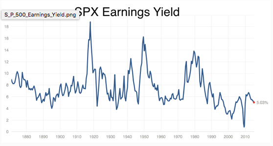
From this it seems to me that the earnings yield has a ``normal'' level of about 6%, and that while there are sustained deviations from this value, it always appears to head back to 6%. The first figure shows that MPK has been declining from 1960 until now, matching the decline in the earnings yield from rouhgly 1970 until today. Was the MPK just on walkabout, and is coming back to its long-run BGP level? And no, I'm not terribly worried about the fact that the MPK is always higher than the earnings yield. They are both proxies, so the fact they don't agree on levels isn't terribly meaningful.
The earnings yields suggests that what is abnormal about the figure for MPK is the high values in the 60's and 70's, not the low values now. The S&P evidence is consistent with that, although the match-up is imperfect. Why was the MPK so high in the 1960's, while the earnings yield didn't rise until the 1970's?
Regardless, in this interpretation, the steady state MPK has stayed roughly the same, but for some reason we deviated in the 60's and 70's to having a high MPK. Perhaps it was atypical shocks to productivity (over and above the regular trend growth rate ${g}$), or atypical shocks to population growth (Baby Boomers?), and we're now coming back down to normal.
The caveat here is that the S&P earnings yield might be a bad comparison for the MPK. But given that the MPK is ex-residential-housing-capital and ex-government, perhaps not.
I don't know that there is a way to distinguish between the two stories, not without doing more research that I don't have time to do right now. Without taking a firm stand on this, one important point here is that the explanation depends crucially on what you take to be ``normal''. And that depends in part on how far back you graph the data. The S&P data suggests a different story than the MPK series (and the MPK series doesn't go back any further because the BLS doesn't have the requisite data any further back). I guess it is a caution that the starting point of your data series is not necessarily the same thing as the ``starting point'' of the economy.