In the last post I used some findings by Simcha Barkai and the BLS to infer that housing may a major source of the rise in the share of profits in GDP. I got an e-mail from Simcha regarding the post, and the upshot is that I’m wrong. First, and foremost, it turns out that I got confused reading his paper, and all his calculations exclude residential housing. This means that my inference from comparing the BLS profit share to his profit share is invalid. You cannot conclude that residential housing profits are driving a rise in profits share of aggregate GDP, because there is no information on housing in Barkai’s number. He documents that the profit share of the non-financial corporate sector is rising over time.
So, my bad on that. Simcha also made a point in his e-mail about how the BLS calculates profit shares, and it makes me lean towards his calculations as being correct. But let’s leave that for another day and post. For the time being, you should go forth and freak out about the increasing profit share in the non-financial corporate sector, whatever your preferred explanation for that may be.
I still had housing on the brain, though, so I wanted to figure whether I was wrong about profits rising in the housing sector. Effectively, I’d like to recreate Barkai’s analysis, but now for the housing sector only. To figure that out, I need to look at the data on the stock of residential housing capital (K), and the imputed flow of value-added from housing (Y). The other thing I need to calculate is the required rate of return on housing (R).
Let’s start with the stock and flow, which I pulled down from FRED. The stock, K, is the “Current-Cost Net Stock of Fixed Assets: Residential” from the national income accounts. That includes all privately owned residential assets, which encompasses both owner-occupied and tenant-occupied. The flow, Y, is “Gross housing value added”, which comes from Table 1.3.5 of the national accounts. This is the BEA’s estimate of the total flow of housing services (including imputed rents for owner-occupied housing) minus the cost of any intermediate goods. Those intermediates would include maintenance and repairs on your house, or the cost of property management services if you owned a rental building.
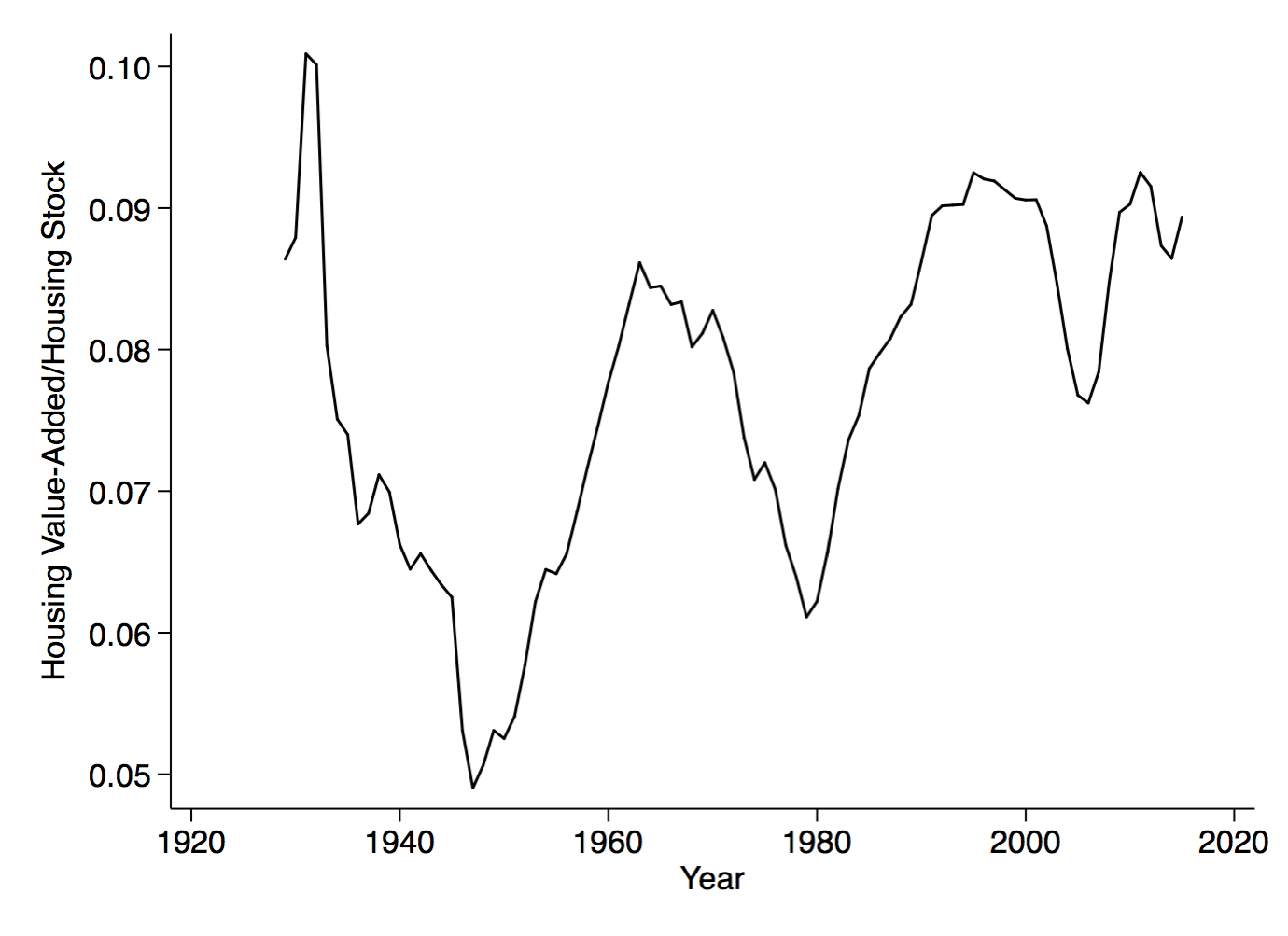
The first figure is the ratio of Y/K, or roughly the average product of housing capital. On average, the flow of housing services is equal to around 8% of the stock of housing. But there are clear fluctuations, with a big dip after WWII, and then subsequent dips around 1980 and 2009. But there is also a tendency for the ratio Y/K to rise from WWII to today, from maybe 6% to 9%. This tendency of Y/K to rise means that the ratio of K/Y is going to fall, and that is going to matter in my little profit share calculation.
I want profit’s share of the flow of housing output. I’m going to assume that no labor is used in providing housing services. Don’t get freaked out by that, the flow of housing services is not the same thing as construction. Construction - which does use lots of labor - is the flow of new housing (or other structures) into the stock. What we’re talking about here is the flow of services provided by existing housing, which does not involve much labor at all.
This means I am assuming that the flow of housing can be split as follows, Y = RK + Profits. In shares, this is just 1 = RK/Y + Profits/Y. If I know RK/Y, I can figure out the profit share easily. Note that RK/Y depends on K/Y, which was falling over time, based on the prior figure. So that, by itself, suggests the profit share was rising.
In addition, it seems likely that R was falling over time. If you remember from the prior post, we could write R = i - g + d, where R is the return on capital, i is the nominal interest rate, g is the expected inflation in the capital price, and d is depreciation. For i, the obvious choice here is the mortgage rate. I (or rather FRED) does not have mortgage rate data going back as far as 1930, but it does have it for the 1970’s forward.
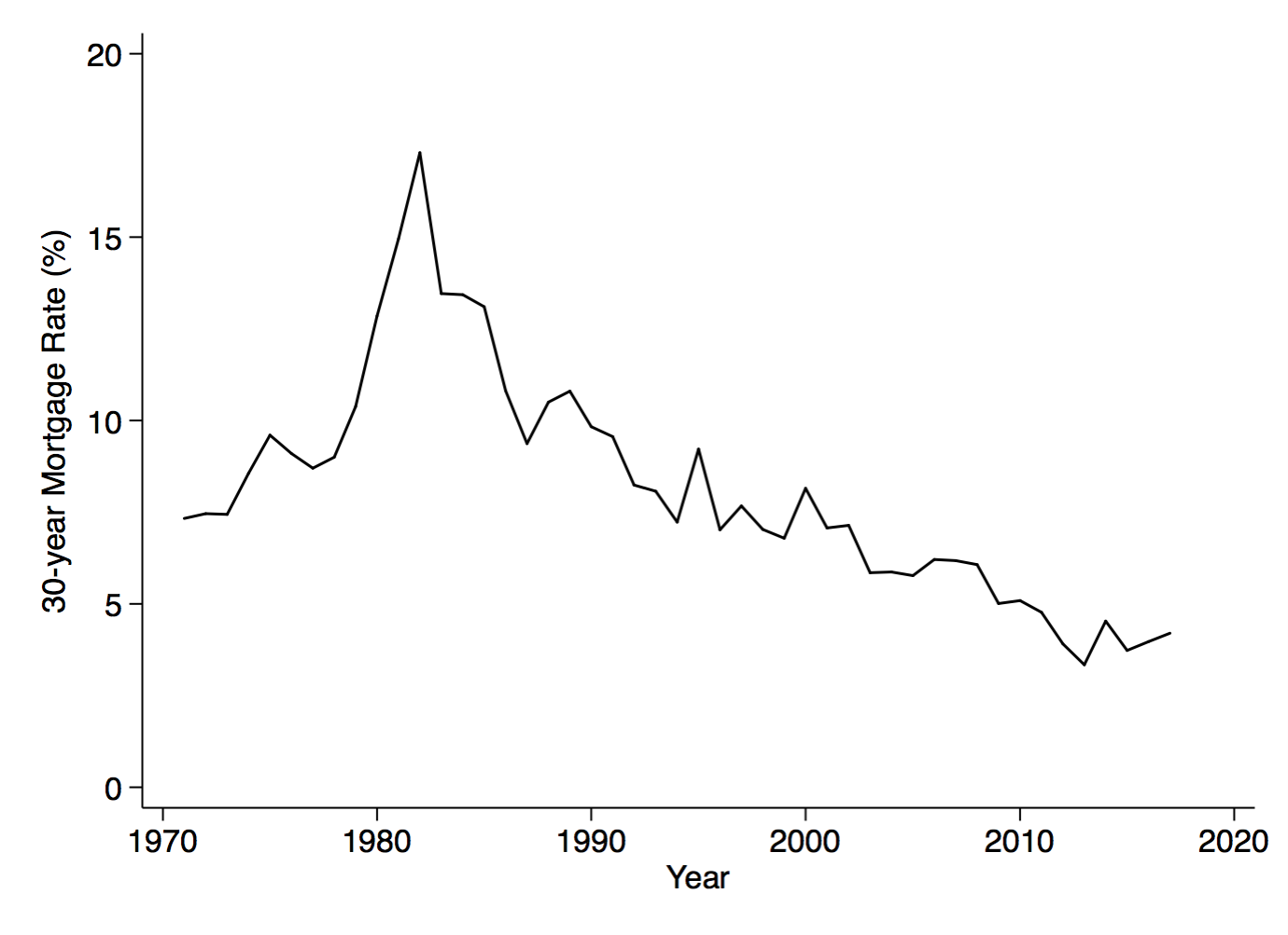
It’s not a big surprise that mortgage rates have fallen over time, much like any other nominal interest rate. They’re under 5% now, from a high of around 17% in 1981. By itself, this is going to drive R lower over time.
The other information I need is on g and d. I’ve played around a lot with these, and I can’t come up with any reasonable assumptions about them that can overcome the drop in nominal mortgage rates over time. That is, if you really wanted to make R go up over time, you’d need people to believe that housing prices were going to fall significantly (so g<0) or that depreciation rates on houses have risen significantly over time. I can’t get my head around how either of those could be true.
For the figure I’ll show below, I’m assuming that g = 3% at all times (not true) and d = 1% at all times (not true). I’m not going to get hung up on the actual numbers, because what we’re interested in is the change in R over time, not the actual level. It’s also a blog post, not a paper. So take the data on the mortgage rate, and combine that with my assumption on g and d to get a measure of R over time. Use that R, and combine it with the data on K/Y, and you’ve got a time series for RK/Y. With that time series, you can solve for Profits/Y = 1 - RK/Y, and I’ve got my profit share in housing.
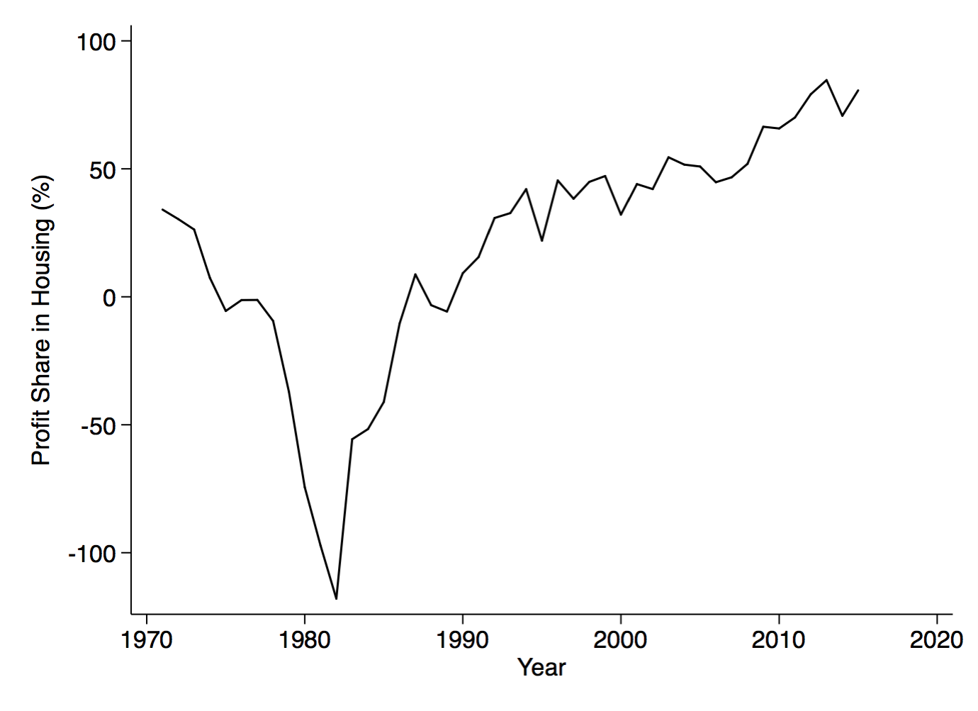
It’s hard to get your eyes off the gigantic negative number in 1981. According to this calculation, the profit share on housing was negative 100%. To be more concrete, what this is saying is that the rent you could get on a house (Y) in 1981 was equal to about half of the cost of the mortgage (RK). You were implicitly losing money owning a home, but if it was owner-occupied, you were losing money to yourself. That dramatic negative profit share is a function of the spike in mortgage rates during the Volcker disinflation, and as I said, it is hard to see around it in the figure. But notice that the profit share started to climb around 1990.
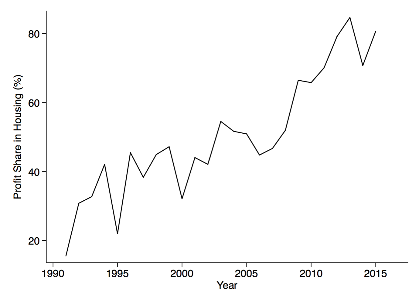
I pulled the 1990-2016 period out to show the evolution of the profit share more clearly. Here the rise in the profit share is apparent, from about 20 to about 80% from 1990 to 2016. I don’t want to get too stuck on the precise level of these numbers, which depend in part on my assumption regarding 3% expected house price inflation and 1% depreciation. But the trend is clear. Because of the decline in the mortgage rate, the cost of owning a home fell, but the flow of output produced by houses did not. In essence, you can rent out your owner-occupied home for more than you’d pay in mortgage costs, and you are profiting. You may be paying those profits to yourself, but there is a profit involved.
Let’s round this back to the discussion of profit shares in the wider economy. Barkai found that the profit share is rising in the private, non-housing, sector. My mini-analysis here suggests that the profit share in the housing sector is rising as well. Combined, that means the profit share in aggregate GDP is rising.
The difference from the last post is that the rise in housing profits is not mutually exclusive with the rise in profts in the private, non-housing, sector. The source of the rise in profits is similar in both cases, as it turns out. The drop in nominal interest rates means that the required return for capital (housing or non-housing) is falling over time, but the flow of output produced in part by that capital is not, so the profit share is rising.