Two goods and two time periods
Visual comparison
The top section on real GDP and affordability growth is a good way to understand what real GDP is measuring. If you recall that section was using an approximation for real GDP growth based on expenditure shares and affordability growth, but this was a little off (remember the Diet Coke example). This section outlines the precise way you’d calculate real GDP in a setting with multiple goods.
In our little two-good world, the real amount of $c_1$ and $c_2$ produced and consumed is a result of an interaction of our preferences for the two goods and the production possibilities frontier that tells us the physical trade-off in producing good 1 in terms of good 2. But we cannot observe the utility function or the PPF, we only observe the actual market outcomes. That is, we see the nominal price that each sells for $p_1$ and $p_2$, and we know the quantity produced, $c_1$ and $c_2$.
Moreover, we observe these market outcomes both in the present, and in the past. And we’d like to compare the bundle of goods produced in those two periods and figure out whether we are better or worse off - whether economic growth occurred. If $c_{2,Present} > c_{2,Past}$ and $c_{1,Present}>c_{1,Past}$, then it is straightforward to conclude that the present is better off than the past (assuming both goods are normal goods).
Things get more complicated when the present does not consume more of both goods, but only more of one of the goods. Still, it may be obvious in this case that the present has higher real consumption than the past.
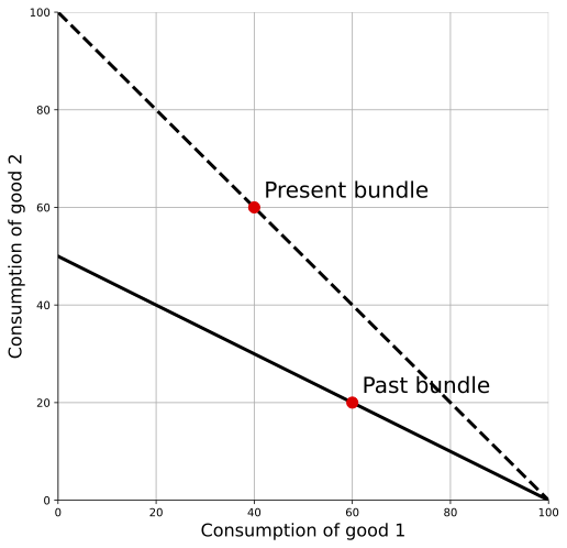
The above figure gives a simple demonstration of this. The lines included have a slope $-p_1/p_2$, which gives the relative price of the two goods in either the past or present. As drawn, that relative price is different in past and present, but note that this doesn’t change the conclusion that the present is better off than in the past in this case. A second thing to note is that pure inflation in prices is not an issue in the figure. We have the real quantities graphed, and the slope of the line is unaffected by the absolute price level, because it captures the relative price of the two goods. What we cannot do just by looking at the figure, however, is put a firm number on the increase in real consumption.
Why is the present better off in the figure above? Note that at the relative prices shown, people in the present could have chosen any point along the dashed line, and that line is everywhere above the solid line indicating the choices available in the past. People in the present chose to consume a little less $c_1$ than in the past, but they could have consumed more of both goods if they had wanted.
A more complicated issue comes when we have a situation as in the figure below, where the present consumes more of good 2 and less of good 1, but the choices available in the two periods overlap. Now, it is not obvious whether the economy is better off or not. If we valued everything at the relative prices of the past, then the present is obviously better (i.e. it would appear that the constraint shifted up). But if we valued everything at the relative prices of the present, then it would look like the past is obviously better (i.e. it would again appear that the constraint shifted up). Notice that this is not an issue with pure inflation in prices, as again all that we’re focusing on here is the relative price of goods within a given period.
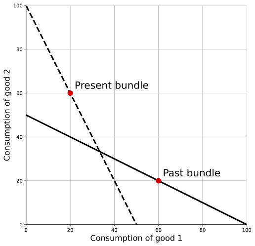
How do we compare past and present, then, and figure out whether the real value of the consumption bundle has increased or decreased? The answer is that we’re going to compare them from both perspectives (e.g. compare them using the relative prices of the past, and then compare then using the relative prices of the present) and do something like average those perspectives.
Mathematical comparison
To do that averaging, we need to add some math. Rather than “past” and “present”, let’s flip over and use period $t$ and $s$, which will save some space.
First, nominal expenditure on goods 1 and 2 in period $t$, valued using the prices from period $t$ is
\[E_{t,t} = p_{1t} c_{1t} + p_{2t} c_{2t}.\]We could set up an equivalent statement for period $s$, where all the $t$ subscripts are just replaced with $s$’s. A different thing we might want to measure (not might, will) is the hypothetical amount you would have spent on the goods from period $t$ ($c_{1t}$ and $c_{2t}$) if you had faced the prices from period $s$ ($p_{1s}$ and $p_{2s}$).
\[E_{s,t} = p_{1s} c_{1t} + p_{2s} c_{2t}.\]And there is a similar statement about nominal expenditure on goods from $s$ using the prices from time $t$,
\[E_{t,s} = p_{1t} c_{1s} + p_{2t} c_{2ts}.\]Okay, that gives us a few ways of getting nominal expenditures in hypothetical situations. But we want to know what your real consumption in period $s$ was relative to your real consumption in period $t$. To do that, we need to use a common set of prices, so that we’re valuing everything in the same terms.
Let’s set up this ratio of real consumption (which, in our really simple two-good economy is just equal to GDP). And let’s set up this ratio assuming that the prices of time $t$,
\[\left(\frac{Y_s}{Y_t}\right)_{t} = \frac{p_{1t} c_{1s} + p_{2t} c_{2s}}{p_{1t} c_{1t} + p_{2t} c_{2t}} = \frac{E_{t,s}}{E_{t,t}}.\]The notation is dense. On the left, inside the parentheses, this is the ratio of real consumption (or GDP) in period $s$ relative to period $t$. The subscript $t$ indicates that we’re forming that ratio holding prices constant at those used in time $t$. On the right hand side, the numerator is the expenditure on consumption goods from period $s$, valued using the prices from time $t$. In the denominator, we’ve got expenditure on consumptions goods from period $t$, valued using the prices from time $t$. By holding the prices constant, we’re really comparing the value of real consumption in the two periods.
But as we saw above, there is no reason that using the time $t$ prices is the right way to do this. We could just as easily decide to use the prices from period $s$. That would look like this
\[\left(\frac{Y_s}{Y_t}\right)_{s} = \frac{p_{1s} c_{1s} + p_{2s} c_{2s}}{p_{1s} c_{1t} + p_{2s} c_{2t}} = \frac{E_{s,s}}{E_{s,t}}.\]Again, dense. But notice the only thing different here is that the prices are from period $s$, rather than $t$. And again, this is a perfectly valid way of comparing real consumption in period $s$ to period $t$.
So we’ve got two equally valid ways of comparing real GDP/consumption in period $s$ to period $t$. Neither is more correct than the other. We want some way to use both, and the idea of “averaging” makes sense. But we have to be careful here, because we’ve got two ratios, and you cannot just take an ordinary mean. I won’t bore you with the (to me, kinda interesting) mathematical reason why. But what we need to do is take a “geometric” mean.
\[\left(\frac{Y_s}{Y_t}\right)_{F} = \sqrt{\left(\frac{Y_s}{Y_t}\right)_{t} \times \left(\frac{Y_s}{Y_t}\right)_{s}}\]The subscript on the left-hand side, $F$, stands for “Fisher”, because he developed this idea of using the geometric mean of the two indices of real consumption. On the right-hand side, you multiply together the two different ratios we calculated, and then take the square root of the whole thing.
Note that the best we can do is create this ratio of real output between $t$ and $s$. There is no way to get an absolute number for real output (like $Y_t$ by itself), as it is meant to measure something like “living standards”, which have no units. We might decide that a given year (e.g. 2009 or 2013) is our “base” year, and assign it a real index of 100, and use the ratios we calculate with other years to create index values relative to that. For example, if $Y_{2010}/Y_{2009} = 1.034$, and 2009 was our base year, then we might report real GDP in 2010 as $Y_{2010} = 103.4$.
Numeric example
This probably all makes more sense if we put some numbers in. Here is some raw data we can use.
| Year | p(Mango) | c(Mango) | p(Beer) | c(Beer) |
|---|---|---|---|---|
| 2018 | $2 | 10 | $5 | 2 |
| 2019 | $4 | 8 | $2 | 4 |
Notice that there is no obvious increase in real consumption from 2018 to 2019. Mango consumption fell, but beer consumption rose. Overall, were we better or worse off?
Rather than walking you through each step of this, I recommend that you go to that sheet and see how I came up with all the numbers that follow. The data and calculations are all available in this spreadsheet. Download to work with the data. The spreadsheet just applies the formulas established in the prior section.
If you calculate $(Y_{2019}/Y_{2018})$ using 2019 prices, then you get 0.91. In terms of 2019 prices, 2019 was worse for consumption than 2018. This makes some sense. In 2019 terms mangoes are relatively expensive compared to beer, but from 2018 to 2019 we consumed fewer mangoes and less beer, so we seem to be worse off.
If you calculatie $(Y_{2019}/Y_{2018})$ using 2018 prices you get a ratio of 1.20. In terms of 2018 prices, 2019 was better for consumption than 2018. That’s because the relative value of mangoes was low compared to beer in 2018, and so when beer consumption increased and mango consumption decreased, that made things look better from the 2018 perspective.
Now, which of these is right? Did 2019 have lower or higher real consumption than 2018? Well, neither is right. We need to use both. Using the Fisher index from above, you get a final ratio of 1.04, which is the square root of 0.91 times 1.20. This says that 2019 had 4% higher real consumption than 2018. On net, the increase in real consumption from the 2018 perspective was larger than the decrease from the 2019 perspective.
If we were reporting this, we might assume that $Y_{2018} = 100$. So our reported real GDP series would be $Y_{2018} = 100$ and $Y_{2019} = 104$.