Energy and growth
Resources - like agricultural land or oil - are clearly part of the economic production function. But so far we’ve ignored them in our models. That isn’t because they are unimportant, but they do require a little more tedious algebra. Before we start modeling things, let’s get a sense of some of the data and how resource use has evolved along with economic growth over time.
Before we start, let’s set just a few pieces of notation that will help interpret these items later on. First, let $X_t$ be the stock of some natural resource. We’re going to talk a lot about energy use, so this would be something like “total proved reserves” of things like oil and natural gas. Then let $E_t$ be the flow of these resources that we actually use in production in a given period of time. You could think of this as “energy use”. Other than that, keep in mind that $Y_t$ is GDP, and $A_t$ is productivity.
Facts on energy use
Here’s a plot of total energy use over time. One can see how this levelled off for places like the US, Japan, and the UK, but kept climbing in places like China and India.
In per capita terms, things looked a little different.. This shows something interesting, which is that energy use per-capita does not necessarily keep rising over time. In particular, for richer countries like the US, UK, or Japan, energy use per capita started to fall in the last few decades. Of course, this was from a high starting point, so they still have higher per-capita energy use than places like China and India. But it isn’t necessarily true that as economic growth continues, so does energy use per capita.
On the other hand, if we look across all countries, the relationship of energy use per capita and GDP per capita is strongly positive.
The cross-sectional relationship in the last figure we can make sense of. Countries that have large resource flows per capita, meaning a high $E_t$, tend to have higher GDP per capita. For most countries at most times, energy use per capita (and total energy use) is rising over time, not falling, implying that $g_E$ is positive. It’s only the rich countries in the last few decades that have falling energy use per capita, and intuitively that seems to be less a question of diminishing stocks of resources than a conscious choice made with respect to environmental and climate concerns.
One plausible explanation for rising energy consumption per capita is that the initial stock of resources, $X_0$ rose over time. We in fact see that proved reserves of oil and natural gas worldwide rose over time. A lot of time and effort goes into exploring for oil and gas resources, so perhaps that isn’t a huge shock.
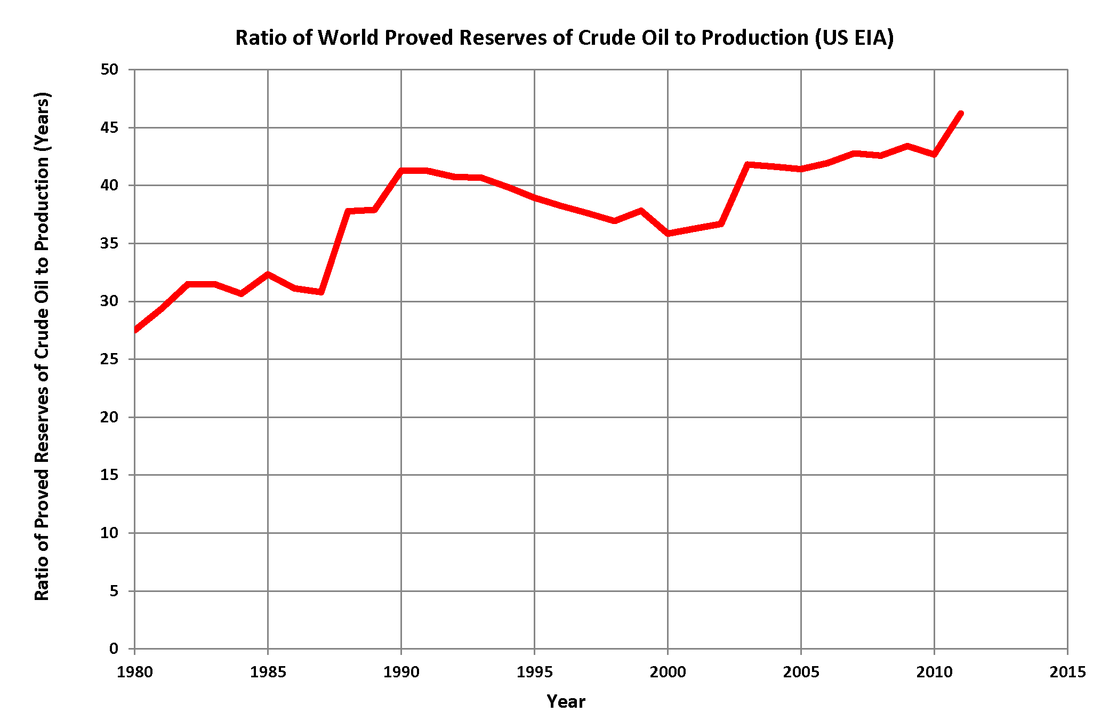
This figure shows, for oil, the world’s proven reserves ($X_t$) over production ($E_t$) since 1980. If $X$ were just a fixed stock then this ratio should be falling over time. The fact that it doesn’t implies that we are, at a minimum, adding $X$ through discovery over time.
Energy factor share and intensity
We have an intuitive sense that energy and resources are important and needed for economic production. Can we get some idea of how ipmortant? Recall from the work on cost shares that the elasticity of GDP with respect to an input is approximately equal to the payments made to that input (in the case, total payments for energy) divided by GDP.
As we go forward we’re going to use $\beta$ as the parameter to measure that elasticity. It’s like the $\alpha$ term for capital in our model, but reflects how important energy is for production, not capital. The sentences above just said that
\[\beta \approx \frac{p_E E}{Y}\]where $p_E$ is what we pay for each unit of energy, E is the energy we use, and Y is GDP. Examining data on total payments $p_E E$ to energy should give us some sense of $\beta$, and how important energy is for production.
The Energy Department produces data on the ratio on the right-hand side of this approximation. The figure plots $p_E E$ as a share of $Y$, in percent, from 1970 until 2019.
There is big spike in the late 1970s and early 1980s (multiple oil crises) but you can look at this and tell yourself a couple of stories. One is that the baseline energy share in GDP has remained about the same over time, at around 6-8%. You could stretch and say that there has been a slight decline over time in that share, from around 8% to around 6% over time. Regardless, the change in energy share has not been massive. And no, the share of GDP going to energy is not like 70% or more. It’s been this low for a long time. This would indicate that $\beta$ - the “importance” of energy in production - has been pretty stable over time. It doesn’t seem that energy has gotten more important over time.
We can kind of break up that $\beta$ term into two parts
\[\beta \approx p_E \frac{E}{Y}.\]There is the price per unit of energy, $p_E$, and then there is this ratio of $E/Y$, which is sometimes referred to as “energy intensity”. This is something like kilo Joules of energy equivalents (total up the energy content of all your solar, oil, etc..) divided by GDP. You can get this information for more countries, so this next figure shows you the $E/Y$ ratio for the US and some selected other countries.
In fact, it does look like energy intensity fell over time. Most countries are using less energy per unit of GDP now than in the past. This indicates improving energy efficiency, as if E/Y is falling then Y/E must be rising, telling us we get more GDP per unit of energy than in the past.
What about $p_E$? This is harder to get for different countries, so back to the US. This price is the implied price of energy based on the information we already have. I set it to 100 in 1970 and you can see everything relative to that.
The implied price of energy rose over time with a few distinct surges during the 70s oil crisis and around the early 2000s and the financial crisis. Even leaving aside those surges there appears to be a tendency for that relative price to rise.
What does this leave us with? Energy’s importance in production, $\beta$, is kinda-sorta the same over time. However, that hides some important trends. First, energy intensity tends to go down, meaning we are getting more GDP per unit of energy. Second, the relative price of energy tends to go up over time. These should not be terribly surprising as a combination. If energy is getting more expensive, then it makes sense that we tried to get more efficient in using it.