Case studies using the Solow model
- Finding the BGP in the United States
- Recovery to a BGP in Germany
- Shift to a new BGP in South Korea
- What’s the deal with China?
Finding the BGP in the United States
We can apply the Solow model to specific cases, and use it to tell the story behind the economic growth that occurred. To start, consider the US, which is relatively boring. The figure below plots the log GDP per capita in the US over time, as we’ve seen before. What I’ve added to the figure are two hypothetical BGP lines. The two BGP lines differ in how they were constructed.
The “BGP All” (in orange) was fitted to the entire span of data, 1950-2017. While actual GDP per capita is not exactly on this orange BGP at all times, throughout the 20th century it stays quite close to the BGP. The experience after 2008 shows a distinct drop relative to the BGP, given the financial crisis. Since then GDP per capita does not look to have recovered back to the BGP. Hold onto that thought.
The “BGP 20th” (in green) was fitted only using the 20th century, 1950-2000. The data in the 20th century stays closer to this line than before. But this would indicate an even larger drop relative to the BGP starting in 2008. If you look closer, you’ll see that GDP per capita appears to fall behind the BGP even starting around 2000.
This gives us some interesting questions. The first is whether the recent drop of GDP per capita below the old BGP reflects a permanent change in the level of GDP per capita, or whether this is a temporary deviation like in the late 1950s-early 1960s. This question has huge implications for the future level of GDP per capita, and so there is a separate section on it later in the coruse.
The second question about this figure, which we’ll focus on for the remainder of this sub-section, is what it means that we found a BGP that “fit” for the US. Recall from the theory that we can adjust $s_I$, $g_L$, $A_0$ and other parameters to move a BGP up and down. Those BGP lines in the above figure are essentially moving those parameters up and down until the line fits the evidence on GDP per capita.
Remember the equation for the BGP of GDP per capita.
\[\ln y_t^{BGP} = \frac{\alpha}{1-\alpha} \left(\ln s_I - \ln(\delta + g_A + g_L) \right) + \ln A_0 + g_A t.\]The slope of the line is $g_A$. This is $g_A = 0.0208$ on the “BGP All” line, and $g_A = 0.0226$ on the “BGP 20th” line. Those values were found using a simple regression of log GDP per capita on time. You can get more information on how to do that kind of estimate here.
The intercept of the BGP involves a little more analysis. What we want is to fill in each of the parameters there such that they produce an intercept matching the data (so, a log GDP per capita in 1950 of about 9.58). Some of these numbers we have already seen data for. $\alpha \approx 0.3$, based on cost shares. $\delta \approx 0.05$ based on assumptions by statistical agencies about how fast capital breaks down. $g_A$ we just established was about 0.02.
$g_L$ and $s_I$ we can get by looking at data for the US. In principle these both change every year, but for the purposes of the BGP we could look at average rates of both population growth and the share spent on capital goods to get an idea of how big they are. From 1950 to 2015, the average population growth rate in the US was 0.011, or 1.1% per year. From 1950 to 2015, the average share of GDP spent on capital formation was 0.249, or about 24.9% per year.
If we put all that together to figure out the intercept of our line we get something like
\[9.58 \approx \frac{.3}{1-.3} \left(\ln 0.249 - \ln(.05 + .02 + .011) \right) + \ln A_0\]The only thing we don’t know here is the $A_0$. Don’t get confused by the 0. We’re treating 1950 as “time zero” for our purposes. It’s the first period we consider. What we’re after is a value of $A_0$ that ensures the level of the BGP matches the data. Since $A_0$ captures productivity, which is not directly measurable, what we do is just set $A_0$ to whatever makes the above equation work. In other words
\[\ln A_0 \approx 9.58- \frac{.3}{1-.3} \left(\ln 0.249 - \ln(.05 + .02 + .011) \right) = 9.10.\]If $\ln A_0 = 9.10$, then our hypothetical BGP will be about right to make it match the data. Now, the actual value of $A_0$ would differ depending on whether we were trying to fit all the data from 1950 to 2015, or just the data from 1950 to 2000, but the principle is the same. If $\ln A_0 = 9.10$, then $A_0 = 8955$. What does that number mean? Nothing. There is no unit to this that we can measures. The best you can do is compare it to the $A_0$ from another country and see if it is higher or lower. But there are not 8,955 units of “technology” in the US, or anything like that.
That’s something that is going to be true throughout. The numerical value for $A_0$ won’t mean much. But that doesn’t mean comparisons of $A_0$ between countries aren’t interesting. The numerical value of $A_0$ means that we can fit a BGP to the existing data, given the observable values for things like $s_I$ and $g_L$.
Recovery to a BGP in Germany
As I said, the US is kind of boring. Germany is a classic case often used to illustrate how an economy converges towards a BGP if they begin “off” of the BGP. Take a look at the figure below, which shows the actual log GDP per capita in Germany, and a BGP fitted to the data from 1990-2015. The fit of the BGP looks pretty good in that later period, but clearly Germany was “below” the BGP from 1950 to 1990. It was relatively poor, but notice the growth rate of GDP per capita was very high from 1950 to 1970/1980 as it caught up.
How do we explain what was happening in Germany? Well, in 1950 we know that Germany was just coming out of the destruction of World War II. The capital stock in Germany was obliterated, so the actual capital ratio, $K/AL$, in Germany in 1950 was very low. What does the theory suggest should happen to the growth rate $g_K$ when the $K/AL$ ratio is low? $g_{K}$ should be very high, meaning there is a lot of transitional growth.
What do we see in Germany with the capital/output ratio (remember this is a close relative of $K/AL$)? The above figure shows that it was lower in 1950, and then after a brief dip it shot upward to about 4.5 by 1980. This is exactly the pattern suggested by the Solow model. And as the K/Y ratio climbed in Germany, the growth rate $g_K$ fell, and so did the growth rate of GDP per capita. This all meant that Germany converged to the BGP shown in the first figure.
It is important to note that the only thing necessary to explain these dynamics are the shock to the actual capital stock in Germany. There wasn’t necessarily a change to any fundamental parameter, like $s_I$, $g_L$, or $A_0$, that had to occur in 1950. All that happened was that Germany had their capital stock destroyed, and so started the 1950s with a low K/Y ratio, and the rest appears to follow from the basic mechanics of the Solow model.
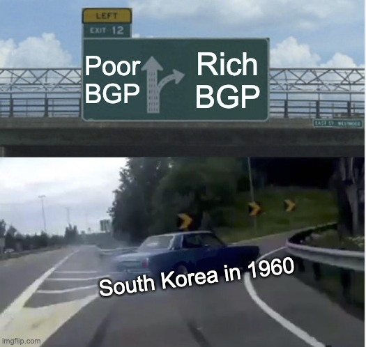
Shift to a new BGP in South Korea
South Korea presents an even more interesting case. Between the Japanese occupation that started prior to World World II, and the devastation of the Korean War in the early 1950s, South Korea was very poor. Not only was it very poor, it seemed to be on a very poor BGP. Unlike Germany in the 1950s, it appeared to be a place stuck at a low level of GDP per capita, not a place temporarily below a rich BGP.
However, a series of reforms in the late 1950s and 1960s appear to have changed the BGP for South Korea. The BGP shifted up to the green line shown in the figure. Let’s say that shift in the BGP happened in 1965. While the BGP shifted, the actual GDP per capita in South Korea stayed very poor in 1965. But now that the BGP was higher, it began to act like any other Solow model economy, and started to grow very quickly, trying to catch up to the higher BGP. And just like Germany, as it became richer the growth rate slowed down and it converged to a new BGP.
It is important to realize that the BGP itself can shift for a country. What would cause this? We know what can be responsible: $s_I$, $g_L$, $A_0$ are the likely candidates. You can also see that $g_A$ appears to change from the old BPG to the new BGP, but for the moment let’s focus on the shifts in the level.
One can read entire books about what happened in South Korea in the 1950s and 1960s to put it on the “rich-country” trajectory. So do not take this as a definitive explanation. But we can look at the rate of capital formation, $s_I$, over time. You can see from 1950 to 1980 how this rate climbs from as low as 10% to in the 40’s. By itself, we know that an increase in $s_I$ would shift the BGP up.
We can tell a similar story using the population growth rate, $g_L$. The rate in the early 1950s is very low, due to the war. But by the late 1950s the population growth rate was over 3% per year, which is an incredibly high number for any country at any time. But note that it then starts to plunge. And from out theory, we know that as $g_L$ falls the BGP should rise. So a second explanation we can give for South Korea’s higher BGP is that the population growth rate fell.
The last part of the explanation would be that $A_0$ rose. Again, don’t get hung up on the timing of this. All we’re saying is that “baseline” productivity shifted up. Now, what did South Korea do to make baseline productivity go up? Well, see those books I mentioned. This can include anything from land reform (more productive agriculture?) to trade deals (exporting to the US?) to better education (creating more human capital?). The Solow model isn’t definitive, but it gives us a framework on which to build explanations for a growth experience like South Korea’s.
What’s the deal with China?
The prior three case studies can all be fit into the Solow model explanation because the data allows us to identify some plausible BGP’s. In the case of China, however, it doesn’t appear that we’ve seen enough of the transition to know for sure what is going on.
Starting in 1950, China was in a situation very similar to South Korea. It had been occupied by Japan and devastated during World War II, and was very poor in the 1950s. It appeared to be on a poor BGP until the 1970s. In the late 1970s a series of reforms began that allowed for more market-oriented activity within China, and eventually opened China up to international trade. Similar to South Korea, one can read entire books about what precisely changed in China in this period. But the evidence is clear that something happened starting in the 1980s such that China began to grow much faster.
This has the flavor of what happened in South Korea. Except that to date, China appears to be in the midst of the kind of transition South Korea experienced, so we can’t identify a clear BGP that it is headed to - or even if it is headed towards a BGP. While all our existing examples suggest that China will reach some kind of BGP eventually, perhaps China really has found a way to grow at a very high rate (6%, 7% per year) for decades.
However, if you look at the last few years, the 2010s, the growth rate of China appears to have slowed. This is consistent with approaching a BGP. The figure plots the BGP from South Korea as well, just as a reference. We don’t know what will happen, but China may be hitting a BGP that has a lower level of GDP per capita than South Korea.
The reasons for the jump to a higher BGP (if that is what is happening) appear to be similar to South Korea’s. The $s_I$ ratio went up. It went up so much that there are actually reasons to believe that the numbers are inflated compared to reality. But taking them as given, $s_I$ rose from around 10% to around 50% over the last sixty years.
Perhaps more famously, China instituted the one-child policy in 1979 to limit what was a high population growth rate. This was actually after the population growth rate had fallen from a high around 3% in the early 1960s to under 2% in the 1970s. Regardless, $g_L$ fell by a substantial amount in China over this period. The severe negative spike to population growth around 1960 was due to the “Great Leap Forward”, an attempt by Mao Zedong to reconstruct China on an agrarian basis that led to disruptions of farming and a massive famine that killed an estimated 30 million people.
The last thing to consider with China is that it is a good illustration of the difference between growth rates and the level of GDP per capita. The rapid growth in China over the last three decades has not put China on the same BGP as South Korea or the US (at least yet). To make clear the distinctions, the following figure shows the log GDP per capita for the three countries.
Note that despite China’s rapid growth, the level of GDP per capita still remains far below South Korea or China. In terms of a ratio, in 2017 log GDP per capita in the US was 10.91, and in China was 9.51. That means the ratio of GDP per capita was $e^{10.91-9.51} = 4.1$, or US GDP per capita is over four times higher than in China. The ratio for South Korea is $e^{10.52-9.51} = 2.74$. China could well be on its way to a BGP that matches the GDP per capita of South Korea or the US, but it will still be decades before it gets there, even with the rapid growth rate is experienced.