Level differences in GDP per capita
Countries with different BGP’s
In the fake economies A and B, they shared a common BGP. Not only their growth rate converged to $g_A = 0.02$, but given the same parameters ($s_I$, $g_A$, $g_L$, and $\delta$) they had identical steady state values of the capital labor ratio and the same value for $A_0$, the level of their GDP per capita converged over time. They shared the same BGP.
The Solow model tells us that countries have a tendency to converge to some BGP, but not that all countries necessarily converge to the same BGP. And the Solow model also tells us what would create differences in the BGP between countries, the parameters and initial value of $A_0$.
Revisit the figure showing the time path of GDP per capita across several countries.
These all appear to be on a BGP for a long stretch of time, as evidenced by the constant slopes. But the slopes are very similar, indicating, as we know, that the value of $g_A$ was very similar. At the same time, the level of GDP per capita at any given point is very different. We saw that GDP per capita in the US was about 2.7 times higher than in Mexico in any given year. So how do we use the Solow model to explain this ratio of 2.7?
Go back to this section and recall that we could write the level of GDP per capita as
\[\ln y_t = \alpha \ln (K_t/A_tL_t) + \ln A_0 + g_A t.\]This holds at any given point in time, regardless of the actual value of $K/AL$. But we’re interested in the level fo GDP per capita on a given BGP. We want to replace that $K_t/A_tL_t$ with the steady-state value $(K/AL)^{ss} = (s_I/(\delta + g_A + g_L))^{1-\alpha}$. This gives us
\[\ln y_t^{BGP} = \frac{\alpha}{1-\alpha} \left(\ln s_I - \ln(\delta + g_A + g_L) \right) + \ln A_0 + g_A t.\]I’ve denoted GDP per capita as $\ln y_t^{BGP}$ because this is the path of real GDP per capita on the BGP, and a country need not be exactly on the BGP. But this equation tells us why the BGP for some countries would be “higher” than others. And by “higher”, we mean that GDP per capita is higher at any given point in time - like the US versus Mexico.
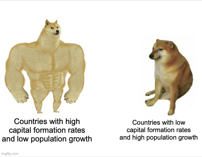
Everything in that equation except the $g_A t$ part tells us about the level of the BGP. A higher share of GDP allocated to capital, $s_I$, will result in a higher GDP per capita along the BGP. In that sense capital accumulation matters for how rich a country is, even though as we saw it doesn’t impact the growth rate of GDP per capita on a BGP. You can tell a similar story for population growth, $g_L$, or for the initial level of productivity, $A_0$.
The value of $g_A$ has an interesting two-part effect. Higher productivity growth lowers the level of GDP per capita, oddly enough, because it lowers the steady-state level of capital/output. But it also raises the growth rate of GDP per capita, so ultimately a country with a higher $g_A$ will end up richer than one with lower productivity growth. But remember, it appears that most developed countries share a similar $g_A$.
The best way to see the impact of all these parameters on the level of the BGP is to play with this. Use this link to open the app in a separate tab, or use it here. If you are using the app here, make sure you scroll down in the sidebar to see all the info.
Evidence across countries
At a primitive level, we now know why some countries are richer than others. We can look at some evidence if some of the theoretical explanations make sense. Start with the share of GDP going to capital formation, $s_I$. The theory says that - holding everything else constant - countries with higher $s_I$ should have a higher level of GDP per capita.
The following figure shows the relationship of $s_I$ to log GDP per capita in several years. If you hit “Play”, there is a lag before the figure cycles through all the available years. Once the animation is done, you can move the slider to see individual years.
There is a rough positive correlation between $s_I$ and GDP per capita. This is neither definitive proof the Solow model is right, nor is the weak correlation definitive evidence that the Solow model is wrong. The problem, of course, is that in the data it is not true that all other things are held equal. These countries have different population growth rates, different levels of $A_0$, and so on. Furthermore, these countries may not all be on a BGP, which clouds the comparison as well. Japan, for example, in the 1970s had a higher $s_I$ than the United States, but was poorer than the US because it was still catching up to its BGP, while the US was on a BGP.
We can do something similar to analyze the effect of population growth, $g_L$. The model tells us that higher population growth should be associated with lower GDP per capita. The figure below gives you a chance to look at the relationship of the two for several years. The population growth rate here is the annualized 10-year lagged population growth rate. So for 1980, this is the annualized growth rate of population from 1970 to 1980.
You get a similar story here. There is a rough negative relationship. But that neither proves nor disproves the Solow model, as everything is not held constant. But the combination of the results in the two figures at least tell us that the Solow model is not, on the face of it, crazy.